UX / UI design · MSc Design Engineering, Imperial College London
FlowState
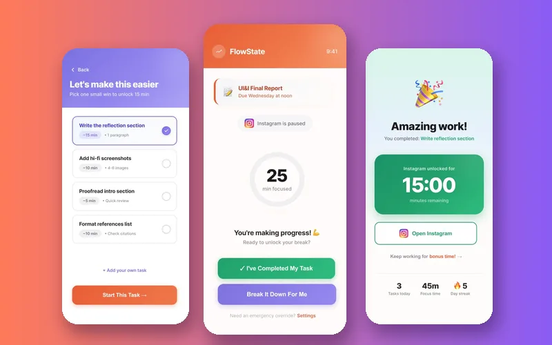
A phone app that pauses whichever apps you choose until you've finished the task you're avoiding. You earn your break with proof of work, not by waiting out a timer.
Blocked time isn't productive time
"Just five more minutes" turns into hours. Social apps are built for dopamine-driven scrolling, and for students the cost is missed deadlines, anxiety, guilt and bad sleep.
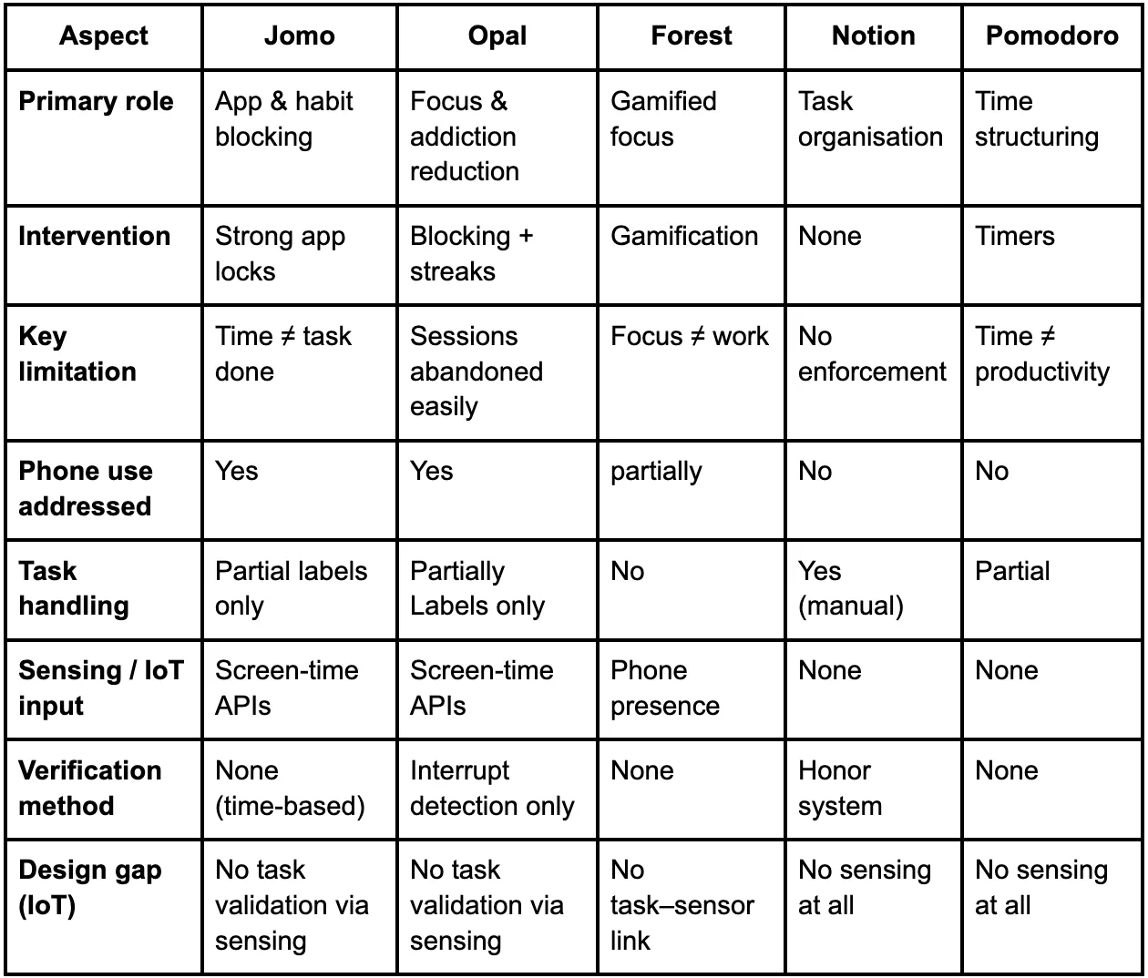
The existing tools come in two separate camps:
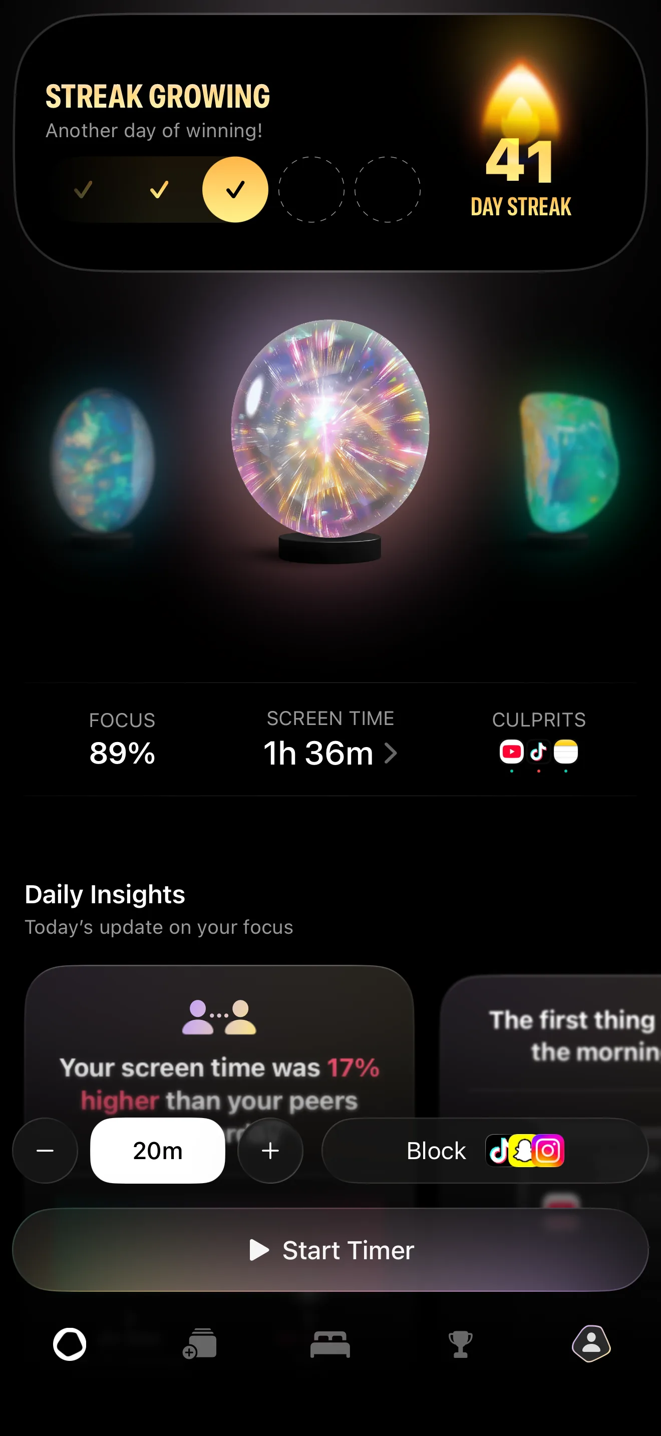
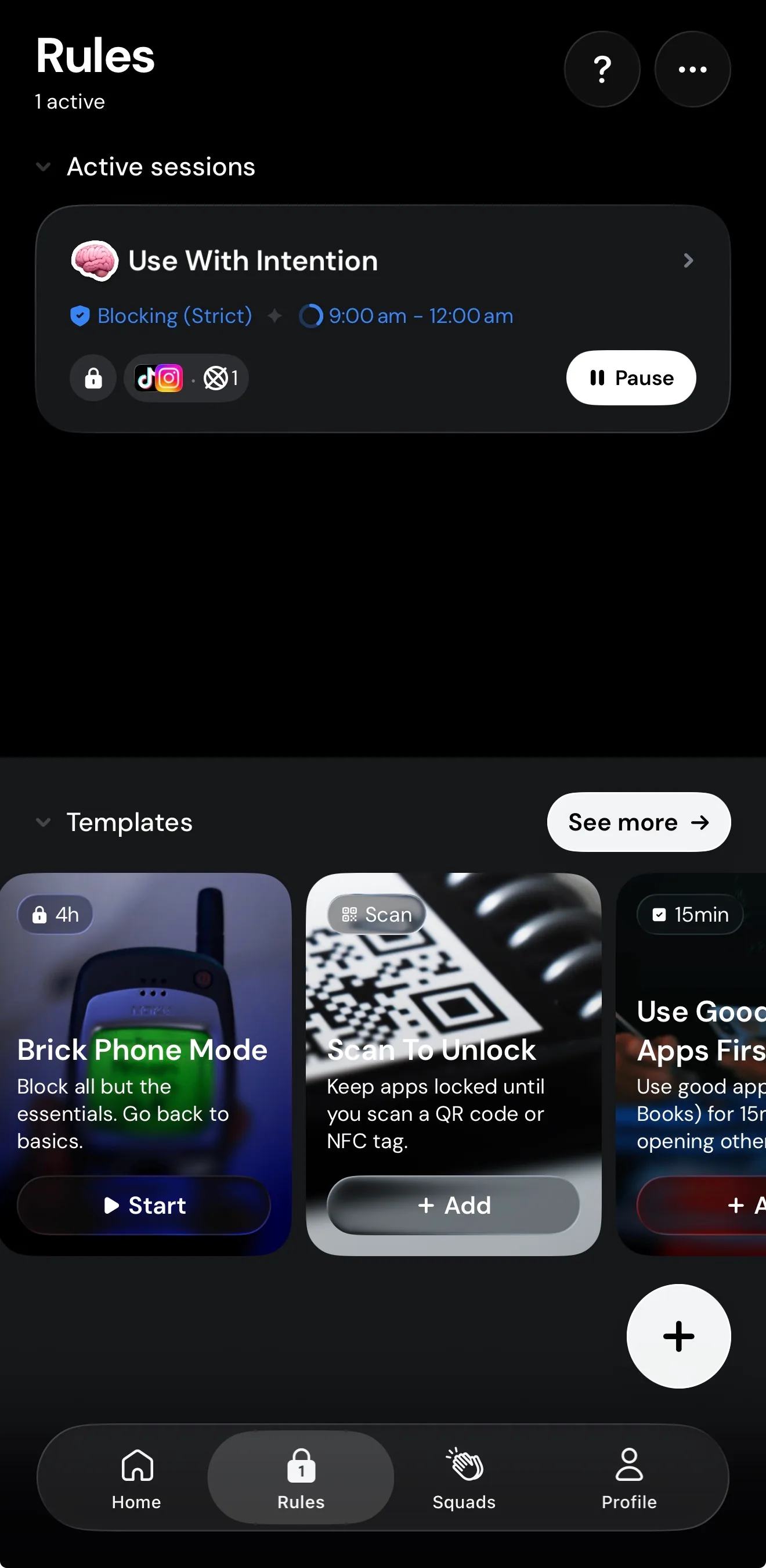
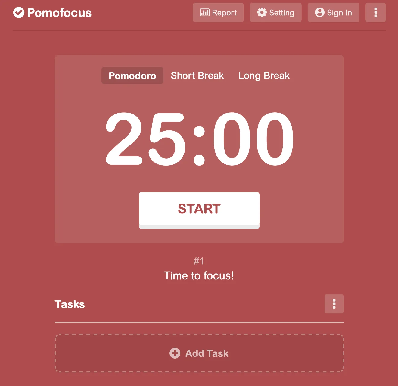
- Phone-reduction apps (Jomo, Opal, Forest) block apps for a set time. The timer runs out whether or not you did any work.
- Task tools (Notion, Pomodoro timers) organise the work but do nothing when you reach for your phone, and they rely on the honour system to tick tasks off.
The gap: no existing tool checks that a task is actually done before giving phone access back. They all use time-based restrictions. None use completion-based accountability.
What students told me
I ran semi-structured interviews with four participants (two master's students, one PhD student and one graduate) about how they procrastinate, when they reach for their phone and what they've already tried. Six themes came out of it:
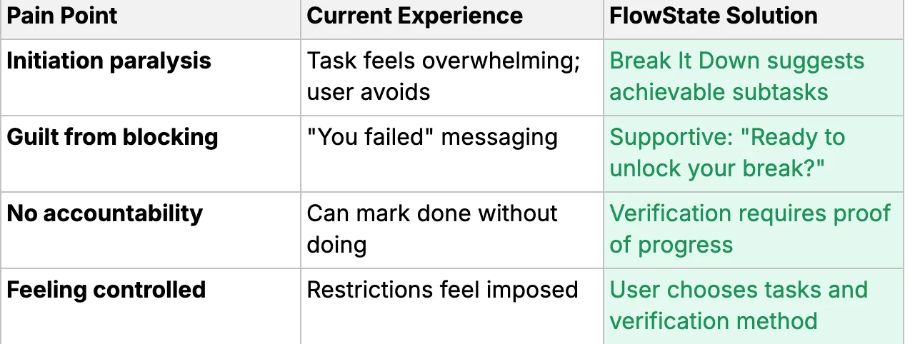
Starting is the hard part
Long to-do lists trigger avoidance. People need help to start a task, and organising it isn't enough.
Phones as a pacifier
People pick up the phone automatically at friction points. Knowing they do it doesn't stop them.
Timers don't verify
Everyone who'd tried Forest or Pomodoro said the same thing: the time passes whether you work or not.
Data breeds guilt
Screen-time stats make people feel bad but don't tell them what to do next.
Support in the moment
They wanted an intervention at the moment they give in, and they wanted it to feel supportive rather than controlling.
Earn it by finishing
Unlocking apps by completing tasks was seen as motivating, as long as it suggests a next step.
"My problem mainly is starting. It takes me ages to get started, but once I do, I'm good to go. But by then, usually most of the day has gone."
— Participant 3"As soon as I reach a friction point… it's like a pacifying almost. I pick up my phone instead of doing what I want to do."
— Participant 2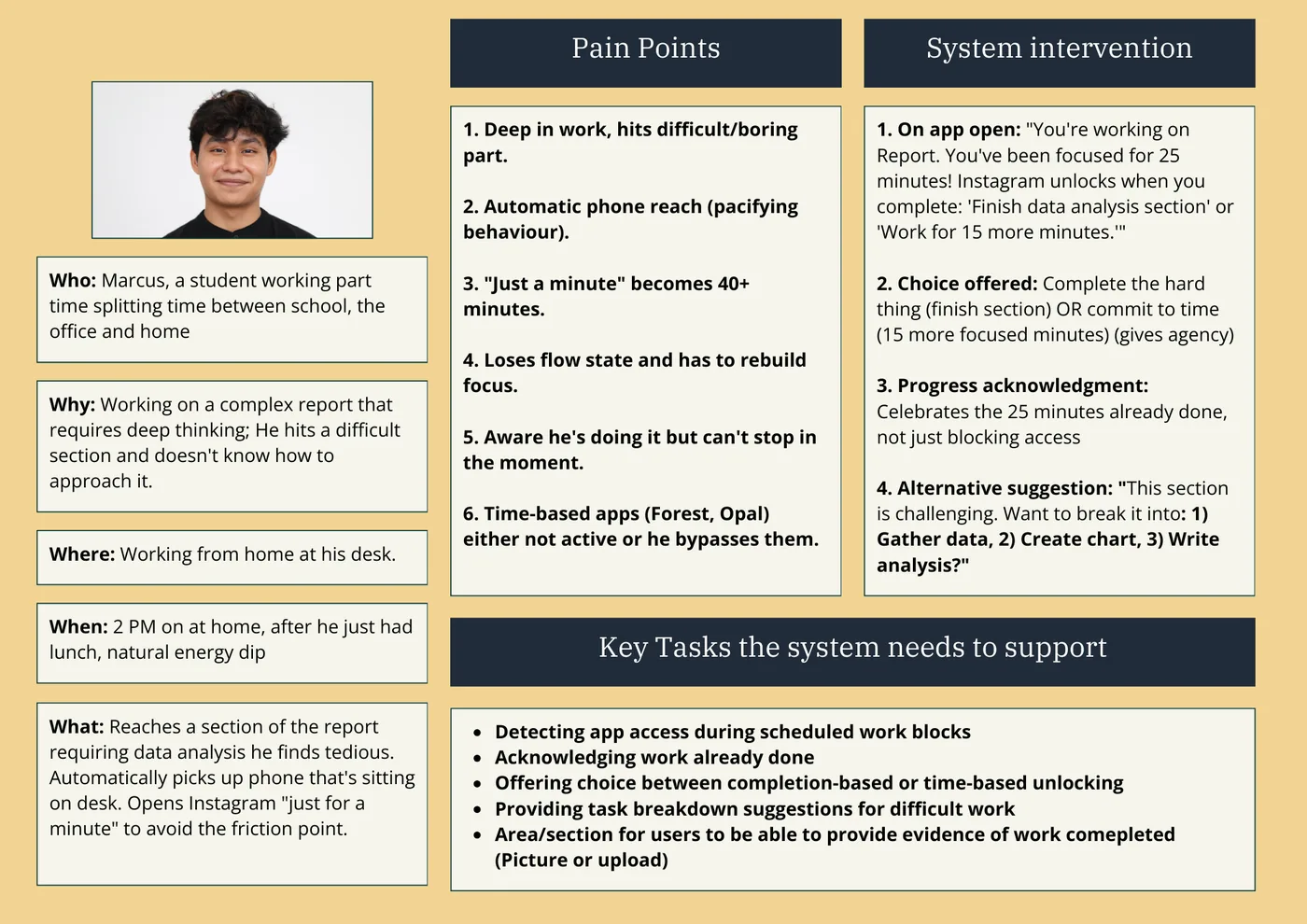
Design aims
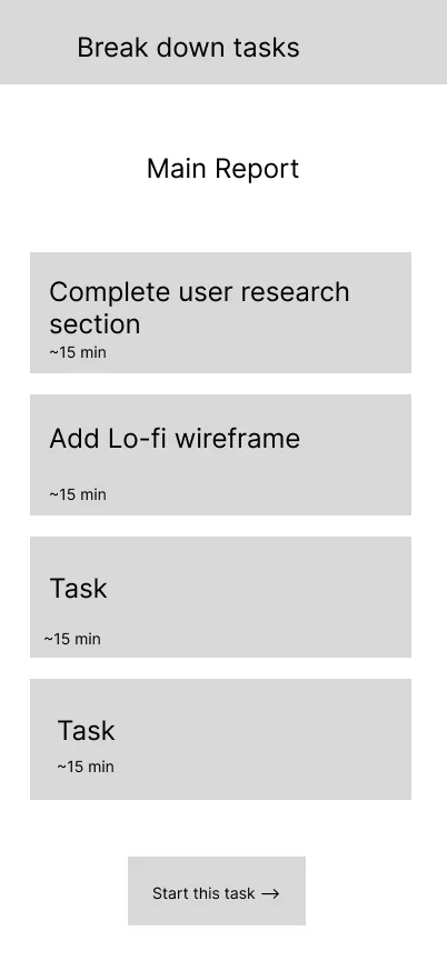
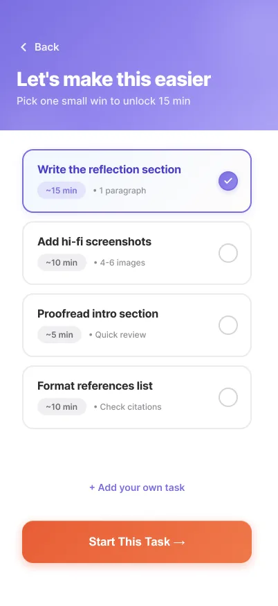
- Help people start, not just plan. Break big tasks into small, timed steps.
- Intervene at the moment of procrastination, so reaching for the phone becomes a choice.
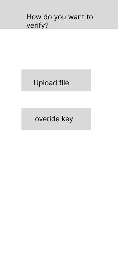
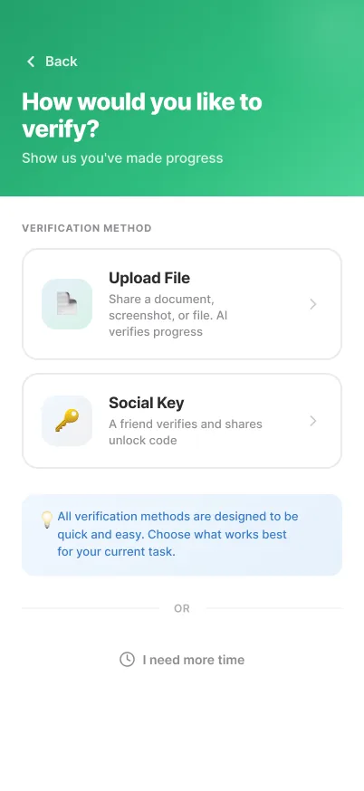
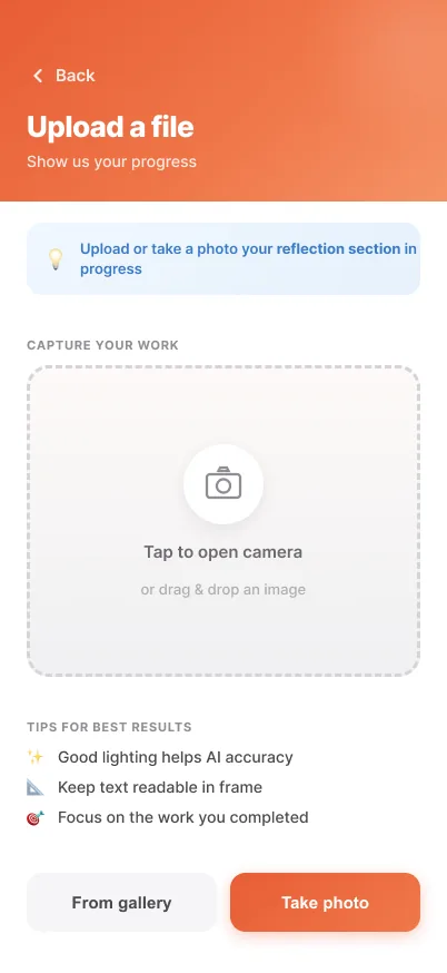
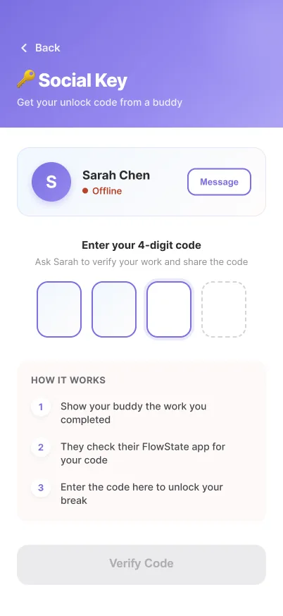
- Tie phone access to completion, not elapsed time, verified with photo proof or a friend's code.
- Show progress and next steps instead of guilt-inducing statistics.
Usability goals
From flows to paper to pixels
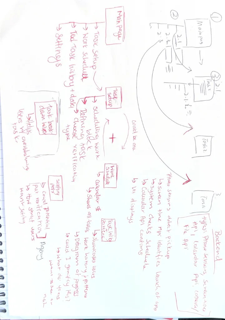
Information architecture
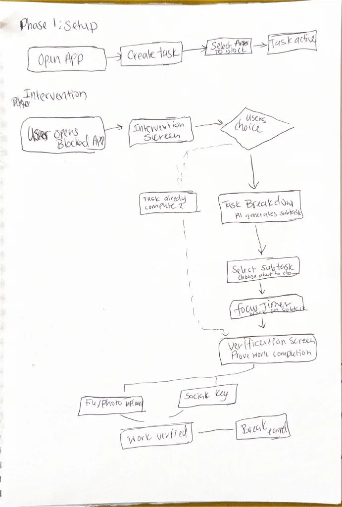
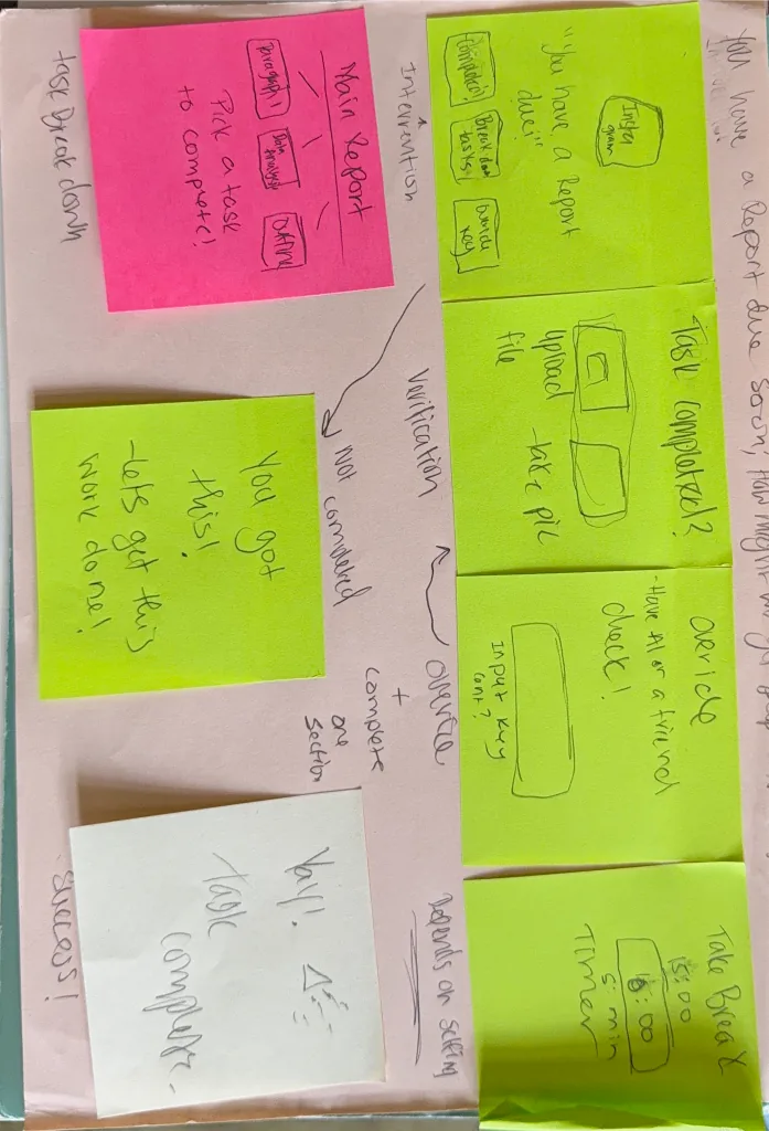
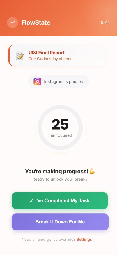
The whole system is built around one moment: when someone tries to open a blocked app. Instead of a dead-end "blocked" screen, the flow runs forward through intervention → action → verification → reward, with an escape hatch back at every step.
Paper prototyping
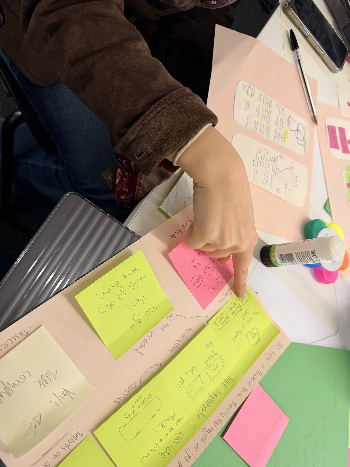
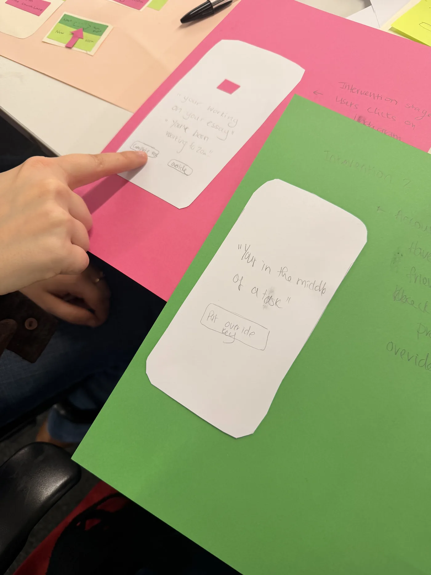
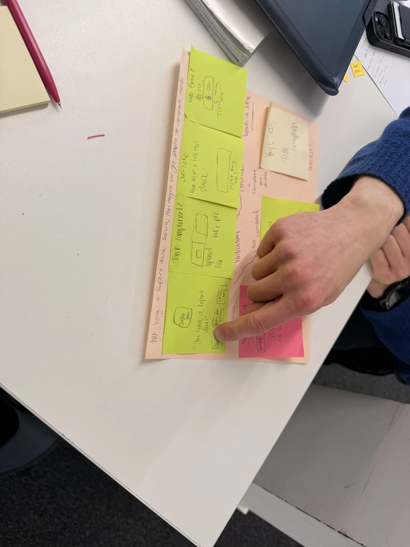
Sticky-note prototypes let me test the flow before worrying about any visual design. Two changes came straight out of these sessions:
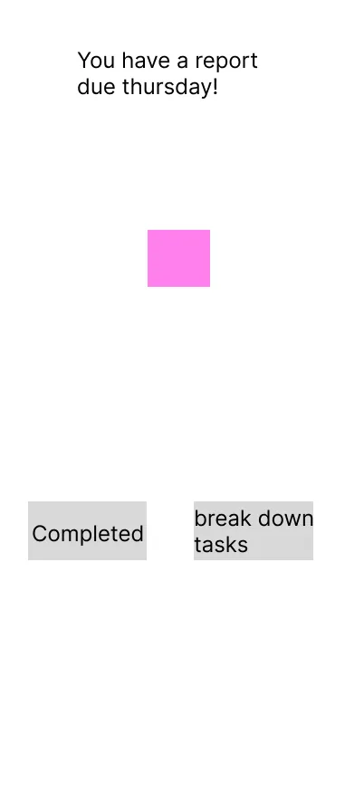
- Three buttons became two. "Task complete" and the override key were merged, leaving I've completed my task and Break it down for me. One tester felt it was "a lot for the one page".
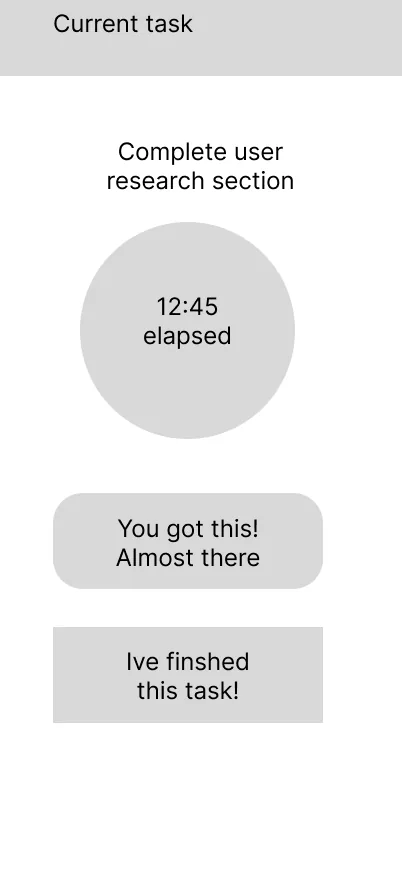
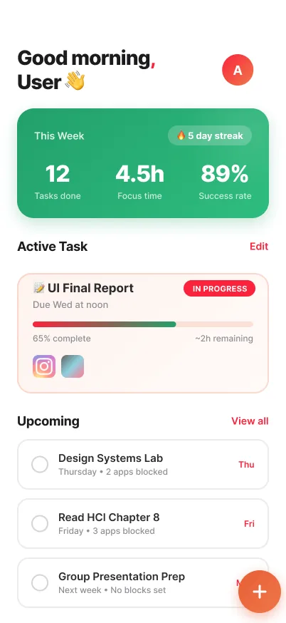
- The current task got its own card, with a bordered, colour-accented card at the top, so the user's commitment is the first thing they see.
Lo-fi wireframes
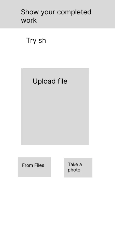
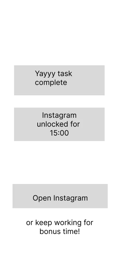
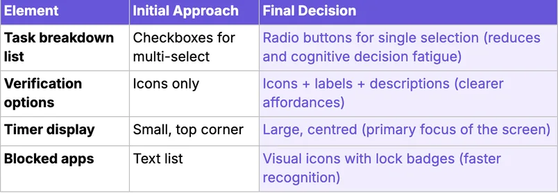
Greyscale wireframes pinned down the hierarchy, spacing and structure before any colour went in.
Colour with a job to do
Each colour has one meaning across the whole app, which makes the flow easy to read at a glance. The palette also avoids relying on red/green, so it still works for colour-blind users.
Type & components: Inter, on an iOS HIG-style scale (28 / 17 / 13 px). Buttons use a 16 px radius with gradient fills and cards use 18 px. All interactive elements meet WCAG 2.1 AA contrast.
The happy path
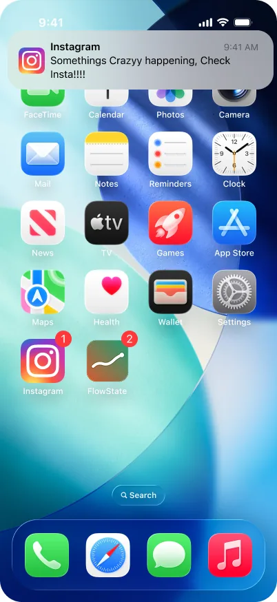
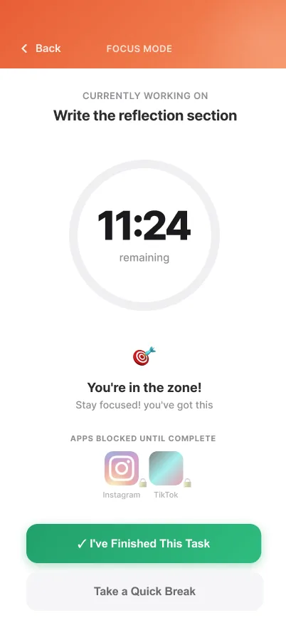
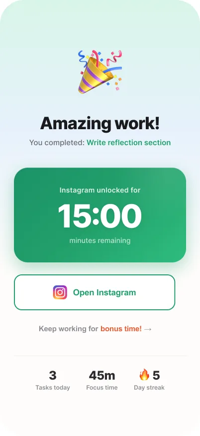
Users choose which apps FlowState pauses. In this walkthrough it's Instagram: Marcus has a report due and opens it out of habit. FlowState steps in, helps him pick one small piece of the report, checks he's done it, and gives him 15 minutes of guilt-free scrolling.
Click through it yourself
This is the high-fidelity Figma prototype of the happy path. Tap the Instagram notification to start.
Testing & iteration
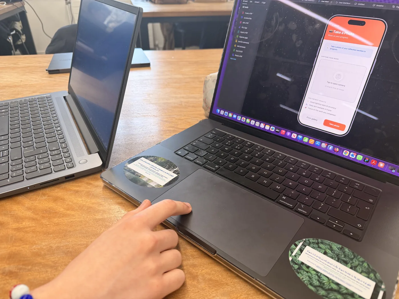
Six participants worked through four core tasks on the hi-fi prototype while thinking aloud. The core idea held up:
"Oh, that's so nice. Now I can know what I need to do next. That makes it far easier to tackle the task."
— on "Break it down""I felt good not opening Instagram because it reminded me not to."
— on the intervention screenSeveral participants said they'd genuinely use it. One pushed back ("locking out is good enough… I'm just being lazy"), which suggests the breakdown feature helps most with starting tasks, less with simple restriction.
What changed
| Issue observed | Design change | Why |
|---|---|---|
| Testers tapped the notification, not the app icon | Both entry points trigger the intervention | Users reach apps through many routes |
| Testers tapped the upload preview, not the button | The whole preview area is now tappable | Match the mental model; bigger target (Fitts) |
| "Photo" and "File upload" felt identical | Merged into one Upload proof option | Less cognitive load (Hick's law) |
Where it could go
Generative AI
Breakdowns that learn from past completion rates, a way to type "I'm stuck on the methodology" and get targeted help, and checking whether an upload shows real progress.
Wearables & smart home
A watch complication and gentle haptics so you don't have to look at your phone to avoid your phone. Lights could shift colour during focus sessions.
AR / VR
Project the current task onto your desk. Any VR focus room has to lead back to the real work, not become another way to escape it.
Looking back
I'm proudest that the research backed up the core idea: participants recognised the problem in their own lives and asked to use the product. Next time I'd widen the participant pool beyond postgrads, since procrastination also covers chores and working life, and I'd design the onboarding flow, calendar integration and adjustable strictness levels.